The Apparent Size of Light
A field note from Astral Twin on treating LED emitters as design units—and using brightness, pixel structure, and viewing distance as part of the image.
The Apparent Size of Light
While developing the side surfaces of Astral Twin for OFFF Barcelona, I stopped thinking of the LED wall as a rectangular screen. The content was built around its physical pixels: small points of light landing exactly on the LED grid, then stepping from one cell to the next. In TouchDesigner, position, color, brightness, and motion were all tuned at that level.
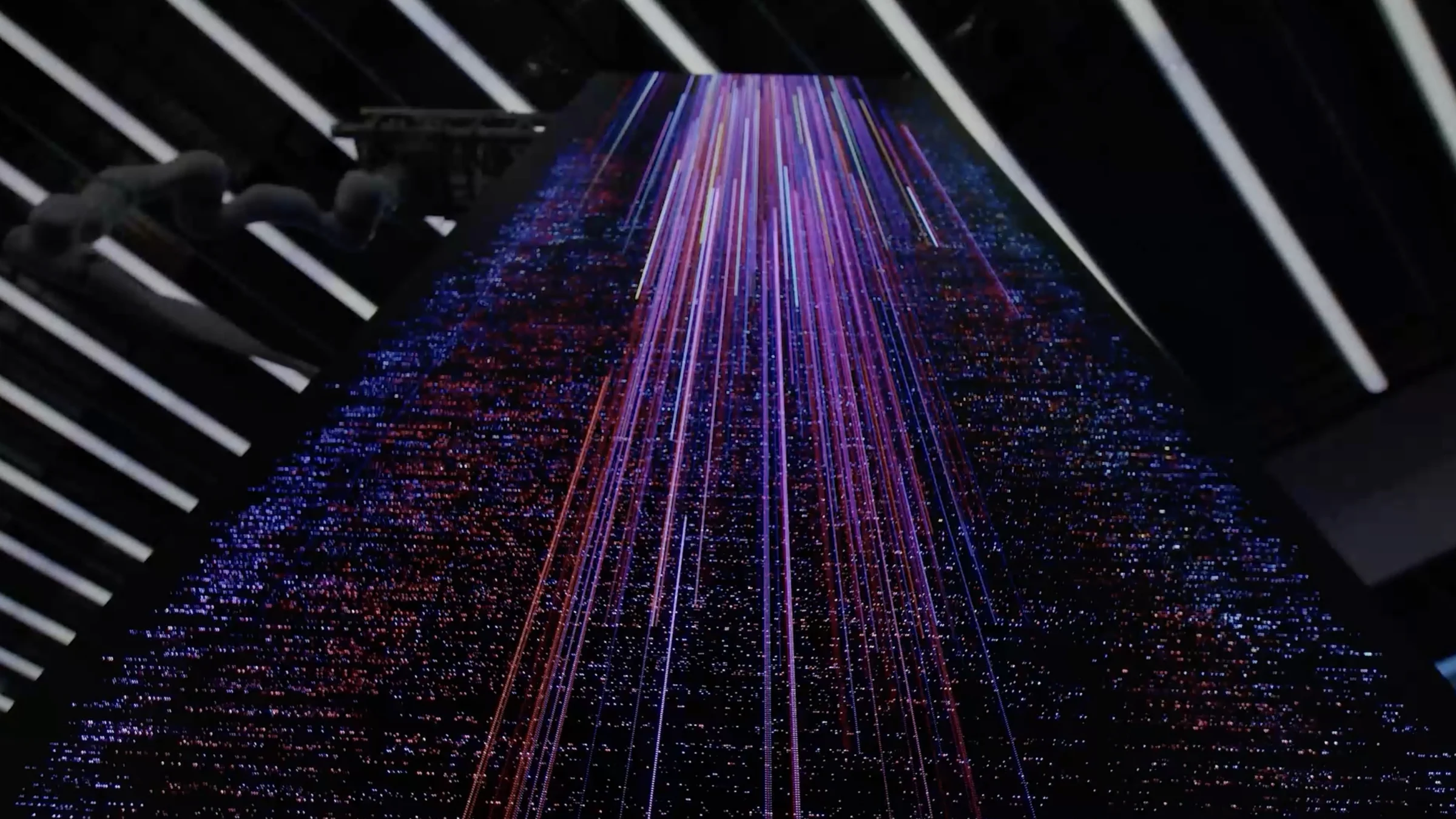
The panel had a pixel pitch of roughly 2.5 mm—not especially dense—but from a distance the result felt sharper than that number suggests. Against black, each lit element became a discrete luminous object rather than a square in a picture. The grid was visible, yet the light seemed to escape it.

Brightness behaves like size
A brighter point does not only look brighter; on a dark field, it can also look larger. This is known as the irradiation illusion. Light scatters through the optics of the eye, but perception is not a passive camera either. Research on the visual system's ON and OFF pathways shows that bright and dark signals are processed asymmetrically, helping explain why light shapes can lose spatial precision and appear to spread.
It is in the same family of effects that makes stars feel different in size even when their discs cannot be resolved by the naked eye. What we read is not the emitter's physical boundary alone, but a footprint produced by intensity, contrast, distance, optics, and the visual system together.
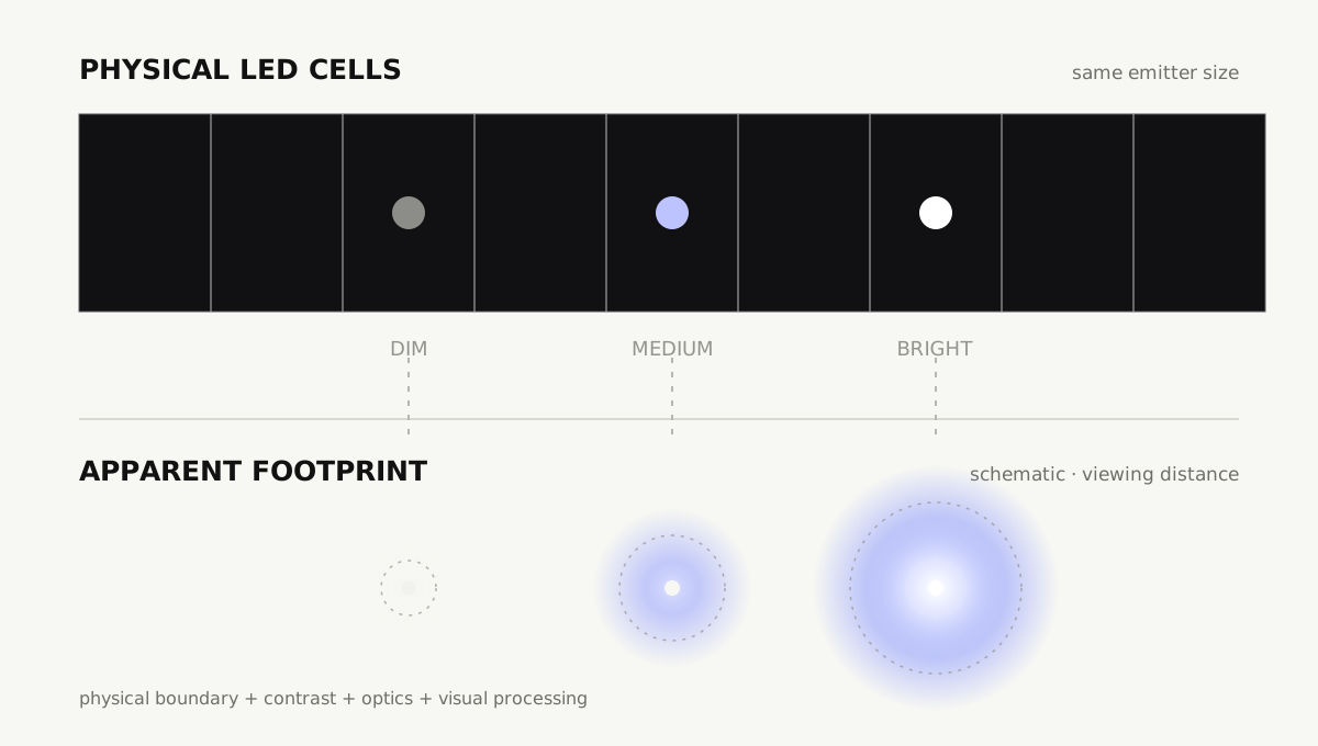
For motion design, this turns brightness into something close to scale. A point can seem to swell, contract, gain weight, or recede without changing its geometry. Carefully sequencing those changes across the grid was part of what gave the surface its strange cosmic and almost archaeological quality: less like footage on a screen, more like a field of signals coming into view.
The pixel is part of the material
The same lesson appears at a much smaller scale in screen typography. On many LCDs, one nominal pixel contains red, green, and blue subpixels. Font rasterizers do not simply place a perfect vector outline on top of that grid: hinting and antialiasing decide which components illuminate, and by how much, to preserve edge position and stroke weight. Microsoft's ClearType is a direct example—it uses the RGB components separately to gain finer horizontal control over letter edges.
That control is display-specific. RGB order, pixel geometry, orientation, viewing distance, and the possibility of color fringing all matter. The rendered edge is therefore not merely a reduced version of the original shape; it is a new pattern designed for a particular physical display and for the way vision recombines it.
This is the practical note I wanted to keep from Astral Twin: when the pixel grid is visible, do not treat it as a defect to hide. Treat it as the material. Snap motion to the real grid, test on the actual hardware from the intended distance, and judge by eye as well as through a camera. Most importantly, treat luminance as shape and timing—not only as color.
Further reading: Kremkow et al. on the irradiation illusion and ON/OFF visual pathways; Microsoft's overview of RGB subpixel font rendering.